Picking stocks and housing bubbles
Applying a Yale expert's forumula to the NZ market - with a shocking result.
Applying a Yale expert's forumula to the NZ market - with a shocking result.
Professor Robert J Shiller won the Nobel prize this year (with Eugene Fama and Lars Peter Hansen) for his work on the analysis of prices of various assets.
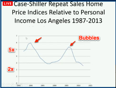
He repeated his Nobel lecture at the Yale School of Management yesterday, and I grabbed a couple of screenshots from the livecast.
His early work tested whether the value of shares is equal to their future dividend streams, and it did. Later he observed that the volatility of share prices (against his model) was mainly due to “innovation” from the companies and the market.
Picking stocks
For me this means investors should hold stocks in companies which have secure dividend streams for regular portfolio growth (e.g. Meridian), pick stocks in companies that will deliver disruptive innovation to get outsize returns (e.g. Xero), and avoid stocks where the companies are subject to being disrupted by innovators and are unable to respond (e.g. Yellow).
Later in his career Shiller came up with the definitive house price index for the USA, which tracks prices for repeat sales:
I raise this because he then put up a slide of Los Angeles house prices versus personal income, relating a story about how extreme ratios a few years ago made it hard for people to choose move there.

So how are we doing in New Zealand?
Even I, a housing price cynic, was shocked by the result when I crudely replicated the analysis.
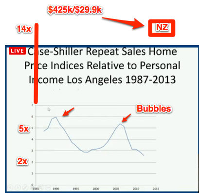
Our latest median (as opposed to average) house price, according to REINZ, was $425,000 in November last year.
The latest statistic for median income in New Zealand from NZ Statistics is $29,900, from the June Quarter last year. That gives a ratio of $425,000/ $29,900 = 14.21.
That wouldn’t even fit on the chart above, so here’s how it would need to be amended to show New Zealand.

A bit more searching and I found the 2004 paper where Case and Shiller asked “Is there are bubble in the housing market?“, and showed that while for most US States the housing prices were directly related to income, but a few (about eight) states were well out of whack, showing more volatility along with higher average ratios.
Click to zoom.
Picking Bubbles
The chart that Shiller showed above shows that the LA prices dropped by over 50% versus income from 2006 until now. My own take is that there is clearly also room in New Zealand for a very very steep plunge in house prices. It would need a catalyst, but let’s remember to not blame whatever that catalyst is, but the system of incentives that has delivered us this ridiculous and very dangerous situation.
And remember – if you are selling your house, then its smart to do so using the latest tools, real estate agent experience and low commissions at 200Square.
UPDATE: This is the housing index that Shiller put together. How I would love to invest (short) on this for NZ.
Click to zoom
Lance Wiggs is an independent consultant providing management, strategy, growth and valuation consulting to industrial, media and internet based businesses. He blogs at Lancewiggs.com